The 'win' isn't always the point.

I’ve always believed that the best design work comes from a place of genuine empathy rather than just ticking off a list of requirements. In a blog I wrote for Red Tangerine about the "Malling Rocks" walk, I talked about how the best experiences, like finding painted rocks in the woods, often come from looking beyond what users say they want and focusing on how they actually feel.
Recently, I had the chance to apply that same thinking to a project that hit much closer to home. I came across a "Call for Artists" for an initiative called Blanketing Our Children (BOC). This isn't your typical corporate rebrand; it’s a province-wide, Indigenous-led project focused on helping Indigenous Governing Bodies (IGBs) in British Columbia reclaim authority over their own child and family data.
The project is about moving away from rigid, one-size-fits-all systems and building digital infrastructure that actually reflects a Nation’s own laws, values, and stories. I decided to enter the competition to design their logo. I didn’t win the $1,000 prize, but honestly? The process of sitting with this brief and thinking about "data sovereignty" as a human story was worth every second of the work.
Designing with intention
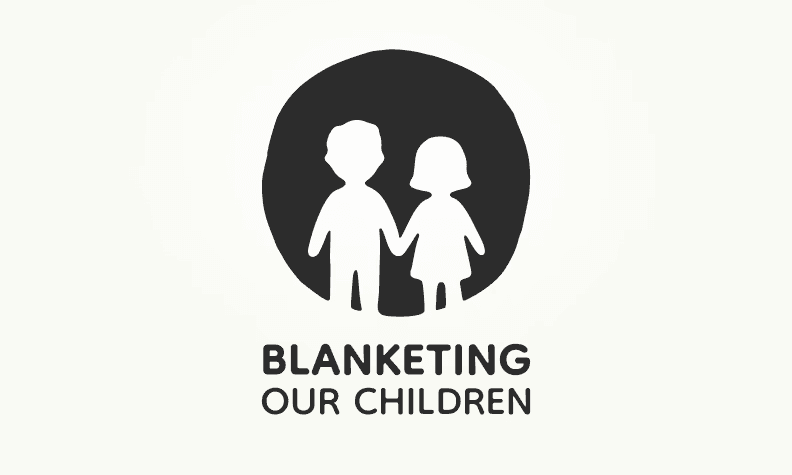
When I was sketching out ideas, I wanted to avoid anything that felt like a "rigid bureaucracy". I wanted the design to feel like a hug, not a spreadsheet. Here’s the "why" behind the choices I made:
The shape: I chose an organic, circular form to represent a "circle of protection" around children and families. It’s meant to symbolize cultural safety and the connection of shared stories, keeping human relationships at the heart of the data system.
The colour: I went with a "Modern Charcoal". It provides a sophisticated, professional foundation that represents the authority of data governance while letting the message of protection stay the primary focus.
The typography: I used the Dongle typeface. It has a rounded, approachable feel that reflects the care and respect at the heart of the mission. Plus, it’s a Google font, so the community can use it consistently across everything they do.
The bigger picture
In the UX world, we often talk about "listening to users," but sometimes it’s about listening to the intent behind the system. This project is about "weaving sacred stories, systems, and sovereignty" together.
I think there’s a lot of value in showing up for projects like this, even when you don't "get the win." It shows that as designers and creators, we aren't just here to make money, we’re here to support the community and help build systems that actually mean something. I’m genuinely excited to see the direction the BOC project takes and how it helps Nations across BC protect their most sacred information.
I’d love to hear your thoughts. If you’re working on a community-led project or just want to chat about how we can make digital systems feel a bit more human, please reach out! You can book a call directly with me today.
If you’re interested in the BOC project or the work being done by SIIA and the BC RIGC, you can reach out to the team at maryczernick@siia.ca.